Sunday 30 November 2014
Thursday 27 November 2014
D.B: 27th November Lesson Update
After watching our rough cut so far I have realise that we have gotten slightly off plan and have been too focused with getting clips onto the timeline to the point where the narrative has been slightly lost.
I edited the part of the video where the lyrics go:
"Through crystal balls I don't see no-one else, else
No I don't see"
I edited the part of the video where the lyrics go:
"Through crystal balls I don't see no-one else, else
No I don't see"
I added in the ELS where Isaac walks to the edge of the car park because I thought the shot would slow the pace down dramatically from the contrast in pace of the music because the audience would suddenly have a distance from the main character to give time for reminiscence and consideration of the narrative.
This meant that some of the other shots didn't make sense in terms of their order. I rearranged them into a more relevant order and then time stretched some of the clips to fit with the cutting rate that went in time to the relevant beats of the music.
There is a shot of Isaac blowing out smoke and, in order to keep the pace of the music slow whilst keeping with the conventions of the genre and keeping the video visually interesting, I cut some parts of the shot up and reversed them. I then copy and pasted the reversed shot and re-reversed it back to normal in time with the music. Stretching, compressing and reversing means that we have to rendering the videos which is fairly time consuming.


L.P: 27th November lesson update

Me and Alex continued editing the footage with the dancers disappearing from Isaac's mind, we decided they would gradually disappear and then he would be standing lost without them as if they have slowly disappeared from his mind. We therefore edited the shorts so that at first, both the dancers were standing next to Isaac looking sad and then they slowly start to disappear, with the shots being 8 frames with Amy and 8 frames with Livvy, and then 7 frames with Amy and 7 frames with Livvy and then 6, then 5, 4, 3, and then 2 which repeated a few times and finally they completely disappear.

I also edited the footage we shot in our pac at TWGGS using flashing lights for the dancers to dance in front of, highlighting their shadows. I edited it so that the clips were a fast cutting rate to the fast pace of the music, the lyrics have finished at this point in the song and it get's really dancey therefore we have placed these clips there.


A.M 27th November Lesson Update
In todays lesson I edited together a sequence where the two dancers appear and disappear. I did this by dragging a clip of our main character and two dancers onto the timeline. Then I layered to other clips over the top of the footage. One clip was cropped to block out one dancer and the other clip was cropped to block out the other dancer. I then cut the clips accordingly to make the dancers appear and disappear. At first the cutting rate is slow and then it starts to speed up. The fasts frame is at 2 frames.
I also continued designing digipacks on GIMP 2.8


Wednesday 26 November 2014
A.M: 26th November Lesson Update
In todays lesson I continued to edit together the rough cut of our video.
Firstly I organised all of the clips we wanted to be in the chorus. I selected our footage which we had shot in london and dragged them into a rough order.
I then started to cut all of the clips to the beat of the song and then ordered them exactly by dragging them onto the timeline. I made the cutting rate of the clips in the chorus fast to contrast with the slower cutting rate at the start of the video.

I edited on a transition to the first clip of the chorus to make an impact and signify the start of the chorus.

Finally we decided as a group to get rid of the text we wanted to use at the start of the chorus as we felt all it did we slow down the cutting rate of the footage.

Firstly I organised all of the clips we wanted to be in the chorus. I selected our footage which we had shot in london and dragged them into a rough order.
I then started to cut all of the clips to the beat of the song and then ordered them exactly by dragging them onto the timeline. I made the cutting rate of the clips in the chorus fast to contrast with the slower cutting rate at the start of the video.
I edited on a transition to the first clip of the chorus to make an impact and signify the start of the chorus.
Finally we decided as a group to get rid of the text we wanted to use at the start of the chorus as we felt all it did we slow down the cutting rate of the footage.
D.B: Lesson 26th November
Before the lesson, me and Alex came to edit in first period because we both had a free.
The current time indicator of the entirety of our footage is just under an hour and for the whole of the free i went through each clip we had and cut the very best bits that we would use and grouped them together nearer the audio of the clip where we were finely editing our final video. Wherever necessary i deleted clips we didn't need in order to tidy up the timeline.
[get screenshot of whole timeline of the end of the work bar area]
By only having the very best parts of our footage in one place it is much easier to drag and drop them over the audio of our track and decide exactly where we want each shot to go. I wasn't completely focused on cutting the clips perfectly in time with the music because my aim is to get a rough cut done by the end of the week.
In a previous lesson I had edited some text over a few clips that visually showed the lyrics of the song that were being mentioned in time with the audio. We decided that this technique was not visually intriguing enough for us to repeat it throughout the video and therefore in a brash but necessary decision we decided to delete it completely.

 There is a section of the visual timeline that cuts very quickly between a clip of one of our dancers putting their hands in the air with another clip place on top of the other dancer doing the same thing on the other side of the screen. By highlighting the best section of this edited footage I grouped all clips together so that whenever we drag and dropped them the timing of the clips would not be effected.
The current time indicator of the entirety of our footage is just under an hour and for the whole of the free i went through each clip we had and cut the very best bits that we would use and grouped them together nearer the audio of the clip where we were finely editing our final video. Wherever necessary i deleted clips we didn't need in order to tidy up the timeline.
[get screenshot of whole timeline of the end of the work bar area]
By only having the very best parts of our footage in one place it is much easier to drag and drop them over the audio of our track and decide exactly where we want each shot to go. I wasn't completely focused on cutting the clips perfectly in time with the music because my aim is to get a rough cut done by the end of the week.
In a previous lesson I had edited some text over a few clips that visually showed the lyrics of the song that were being mentioned in time with the audio. We decided that this technique was not visually intriguing enough for us to repeat it throughout the video and therefore in a brash but necessary decision we decided to delete it completely.
There is a section of the visual timeline that cuts very quickly between a clip of one of our dancers putting their hands in the air with another clip place on top of the other dancer doing the same thing on the other side of the screen. By highlighting the best section of this edited footage I grouped all clips together so that whenever we drag and dropped them the timing of the clips would not be effected.


D.B: 13th and 17th November Shoot Evaluation
PAC - November 13th:
This was a very quick shoot that only took 20 minutes.
> I took
PAC - November 17th:
This was a very quick shoot that only took 20 minutes.
> I took
PAC - November 17th:
D.B: Lesson 25th November
It was Laurel's turn to edit this lesson so i took it upon myself to fix some of the posts that have been suggested needed changing by the teachers. Every lesson it is important that one of us is in charge with making sure the blog is at an acceptable standard and if it is not then making to do lists for everyone to refer back to.
I added written feedback that was given to us about our first 50 second rough cut and typed up about the shoot we had on the 17th because we forgot to do it previously. There were some spelling errors in some of the titles as well so I checked all of them to make sure that they were acceptable.
Tuesday 25 November 2014
A.M: 13th and 17th November Shoot Responses
On the 13th November we went to our schools drama block to shoot
the girls lights,
On the 17th November we went to the drama block to film our main character
the girls lights,
On the 17th November we went to the drama block to film our main character
A.M: Lesson 25th Novemeber
In todays lesson the 25th November I edited together the shots of our main character in front of the greenscreen. I used final cut pro X editing software to do so. I used the keyer effect to get rid of the green screen. I changed the amount of blend and edge blur etc until I got the desired effect. Next I cropped the rest of the shot. I then overlayed the clips of the kaleidoscope shots onto the keyed shots.

It produced a very professional looking footage. I then went through all the footage and selected the best parts ready to put into the timeline with the rest of the footage.


L.P: 25th November lesson update

I spent this lesson editing our music video. I edited the shots with the dancers disappearing from Isaac's mind and therefore his happiness is disappearing too, as the dancers represent his happiness. We have decided to have them staring at Isaac and looking unhappy, which is a contrast to their happy laughing faces previously in the music video. They start slowly flashing and disappearing, inspired by Bombay Bicycle Club's music video to Carry Me, we use this technique in another part of the music video as well. I used the clips of just Amy standing on the left side of Isaac and other clips of just Livvy standing on the right side of Isaac, I layer them over each other and made the cutting rate really fast on the visual timeline. I cut the clips so that they were only 2 frames before it would cut to the other girl standing next to Isaac, I had to really zoom into the timeline in order to do this as I was using a really small number of frames.

Once the dancers disappear, Isaac finds a gold bracelet on the floor and puts it on, this bracelet is used to connect the juxtaposed narratives of the unhappy scenes on the rooftop and the happy scenes with the dancers in London. We have used a close-up of this bracelet on Isaac's wrist to make this connection for the audience.
D.B: Ideas for adverts
I went on the websites of the magazines that we decided we would advertise in, in order to research how they promoted the artists they featured. In order to create an advertisement individually specified for the magazine we needed to know the magazines conventions.
Mixmag:


Attack magazine:
EDM magazine:
Maxumi:
doesn't really use adverts sometimes has the artist


I Voice:
They put the singles cover on for new releases


Magnetic:
Also only really uses the single cover

Mixmag:
Attack magazine:
EDM magazine:
Maxumi:
doesn't really use adverts sometimes has the artist
I Voice:
They put the singles cover on for new releases
usually features the artist on the reviews
Magnetic:
Also only really uses the single cover
Monday 24 November 2014
Group: Screen shots
We have decided that we would like the front cover of the single to be blurred because this is very much like Snakehips' previous digipak work. We have been through the footage we have from London and screenshotted all of the still we think could use as the image. We have found some that would be perfect for the front cover:


Some of them would be perfect for the inside cover because it isn't dramatic or captivating enough to be used on the front but is still aesthetically pleasing and matches the meta narrative:


Thursday 20 November 2014
A.M: Digi pack designs
I have started to create some mock up front cover designs for our digi pack.
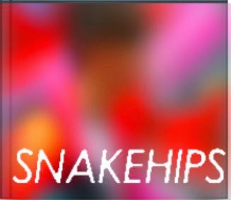
I have chosen an image of our main character in the music video. The colours in this image are very vibrant and eye-catching.
First I have increased the saturation of the image and changed the brightness and contrast. Then I have experimented with placing the text in different areas of the cover to see what looks best.

I placed the text at the bottom of the cover to begin with. I have used the same font which snakehips use for all of there album artwork. I like the use of a strip across the album cover as it makes the title stand out and look bold.


Here I have made the text white on one cover and black on the other. Using the white text is more appropriate as this is what previous snakehips album cover artwork has looked like. Also it looks very clean and sleek in white.


This is the cover in black and white. However I think colour looks better for this front cover image.

Here I have found another image and placed the white text at the bottom again. I have tried to imitate a technique used on previous snakehips artwork by blurring the image which is shown below.

I think this looks very effective and is one of my favourite designs. It is bold and makes the title of the single very clear. It is also very eyecatching and interesting to look at due to the colours.
This is the same image below but less blurred so that you can make out it is the main character on the front of the cover. However I think that the enhanced blurring looks better.

I thought w could use this image for the back of our digipack. It looks very effective with the two characters standing at the edge of the image and the text could be placed in the middle of the two girls.

Subscribe to:
Posts (Atom)